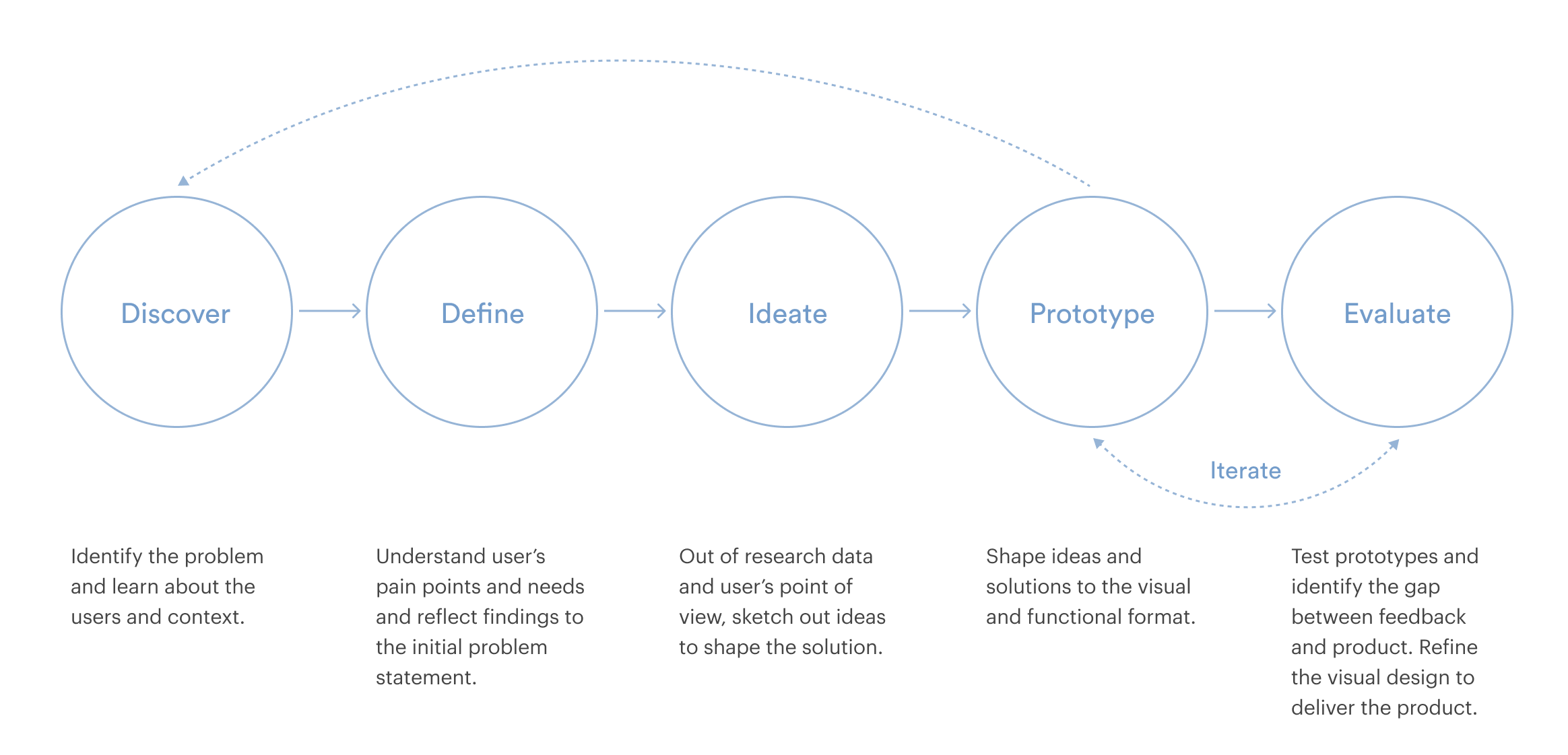
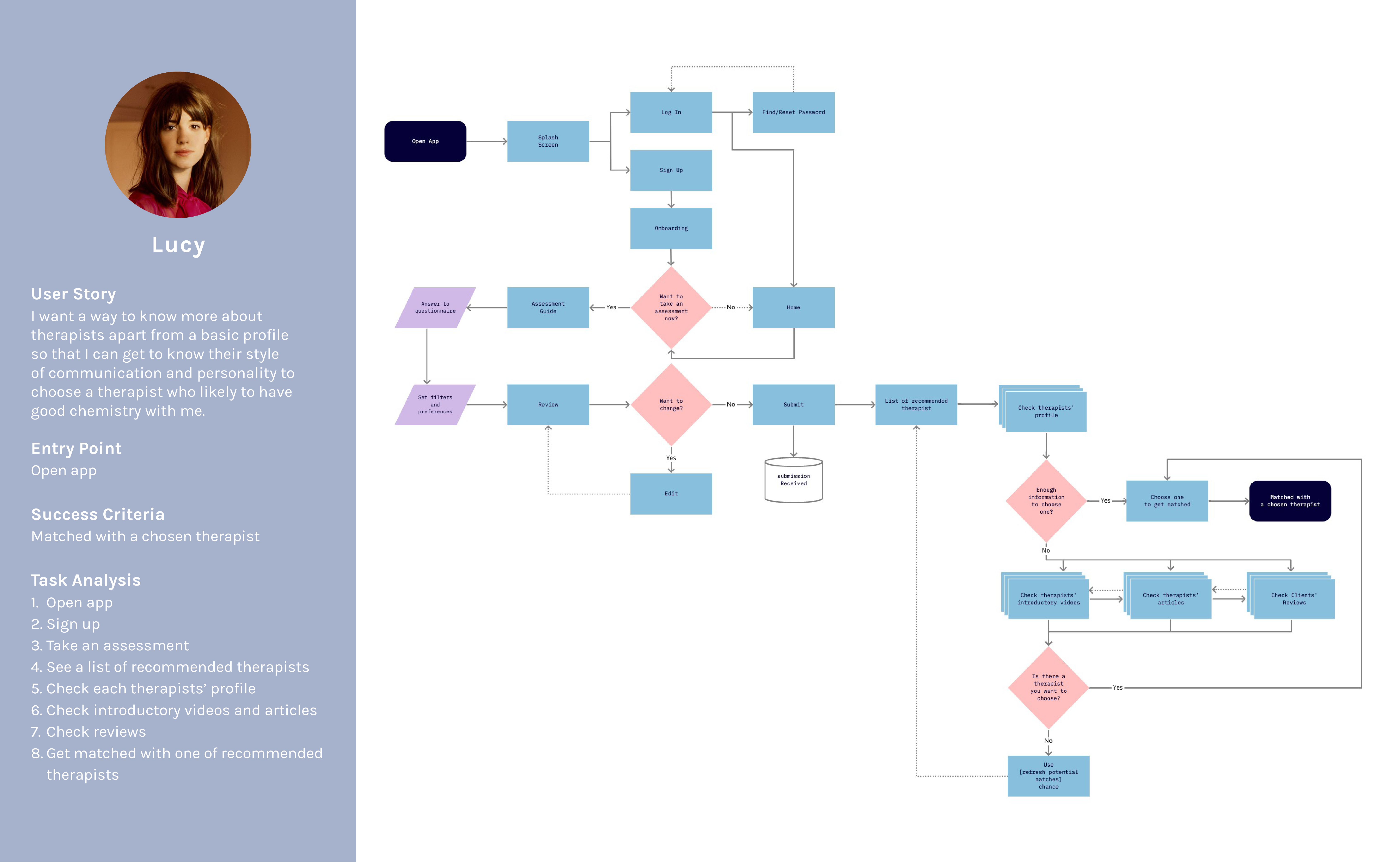
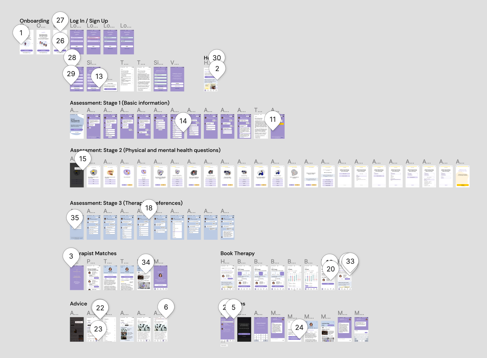
Informed by a refined sitemap, I hand-sketched a low fidelity prototype with pen and paper to quickly highlight the high-level functionality. As the first phase of prototyping, I focused on roughly sketching out multiple versions of each screen to come up with a better solution rather than perfecting a specific wireframe.
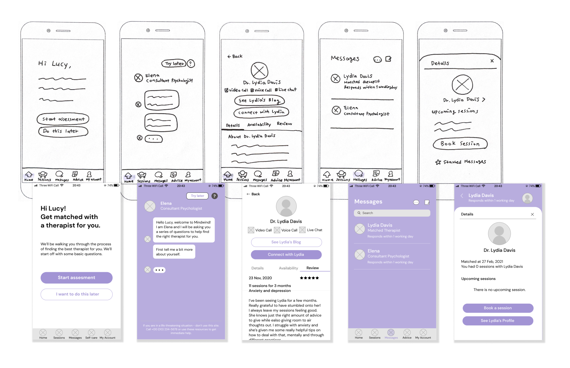
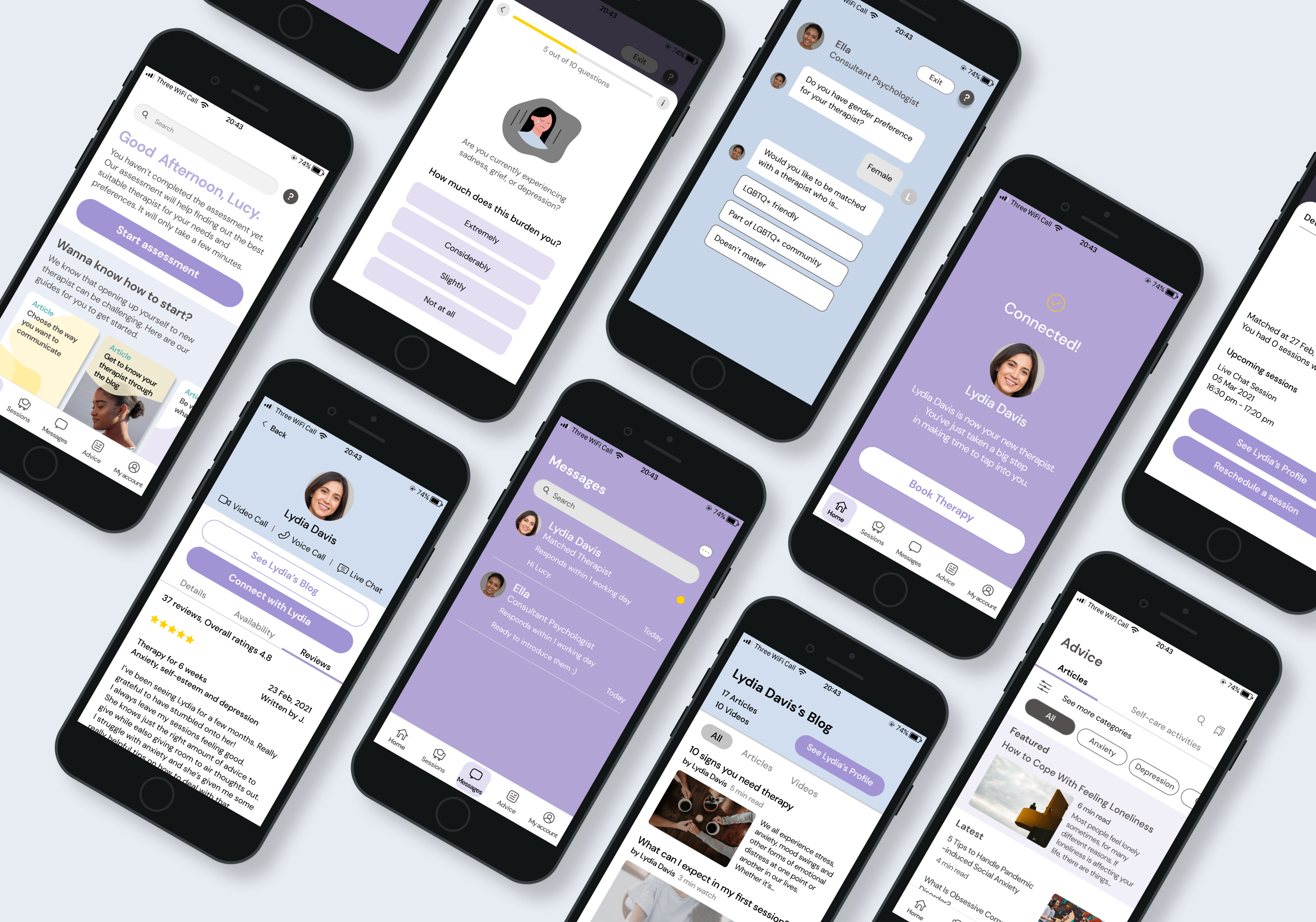
Based on the layout and elements picked up from low-fidelity wireframing, I started migrating my hand-sketched prototype into a digitally created mid-fidelity prototype, which portrays more detail. Then I developed it into a clickable high-fidelity prototype as an MVP, which I used for user testing at the next stage.
After drafting a high-fidelity prototype, I conducted user testing sessions as a moderated remote study. The goal of this usability test was to assess the utility and usability of the app. I observed and measured if users understand the app, its value, and how to complete basic functions such as signing up and navigating and core functions such as connecting with a therapist, booking a session, and messaging. The test includes assessing the completion rate to perform specific tasks and users' stress level while executing those tasks.

6 participants

moderated remote test
by video conferencing

15 to 50 minutes
for each session
After the user testing, I analysed 4 hours of recordings by affinity mapping and creating rainbow spreadsheets, recording behavioural patterns presented by participants and measuring the severity of the errors made during the sessions.
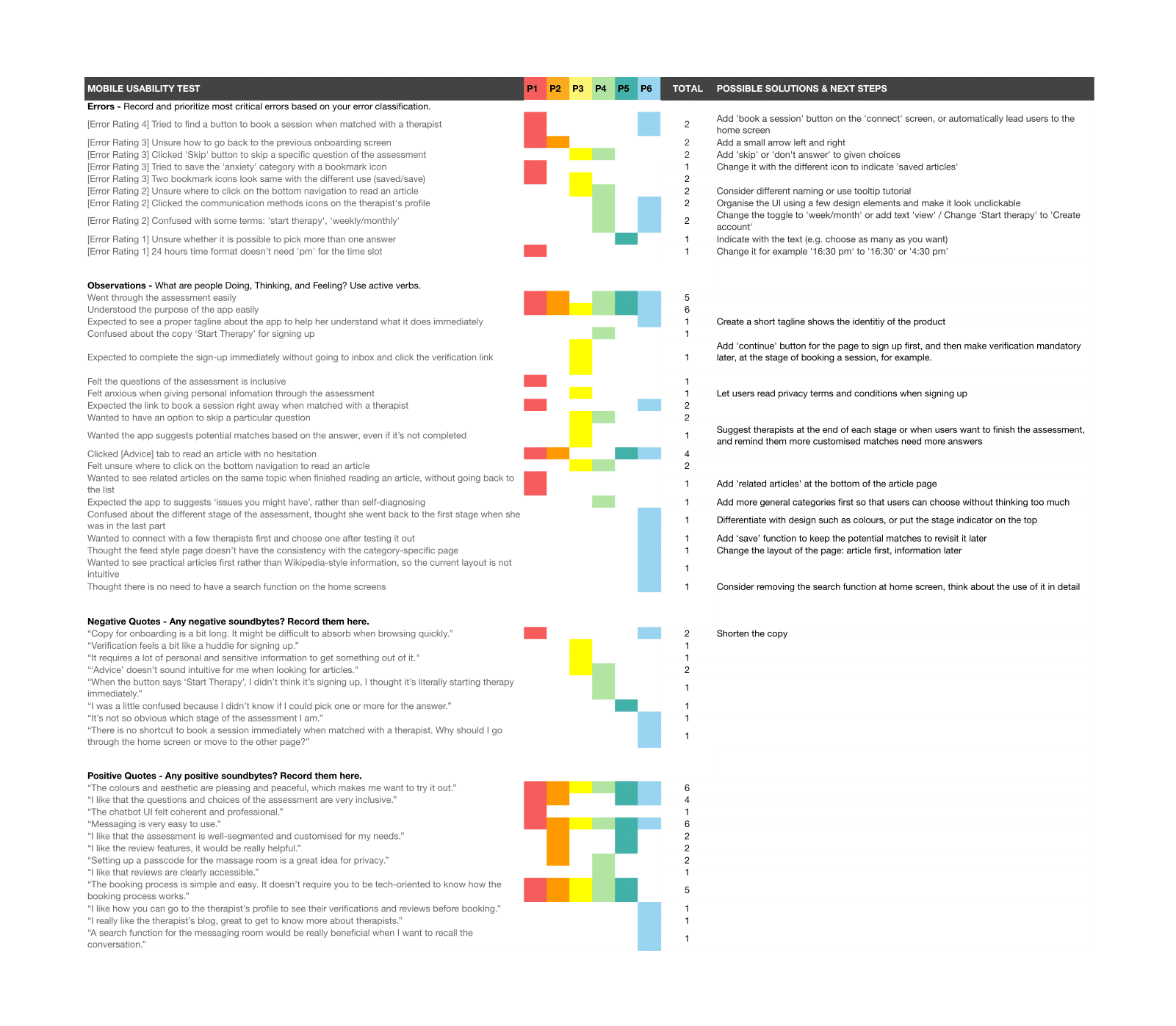
With this process, I discovered and prioritised 4 issues that need to be fixed for better usability.
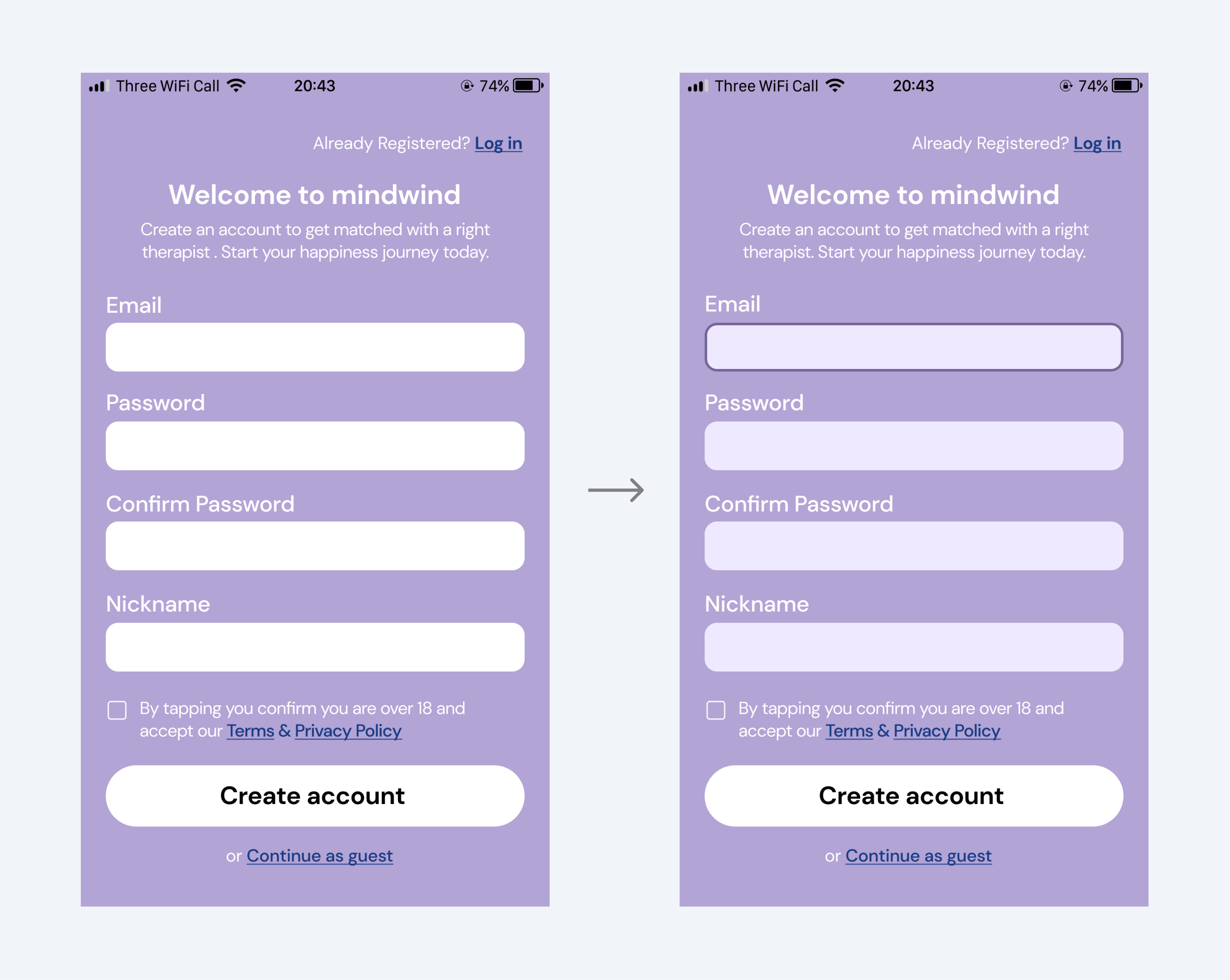
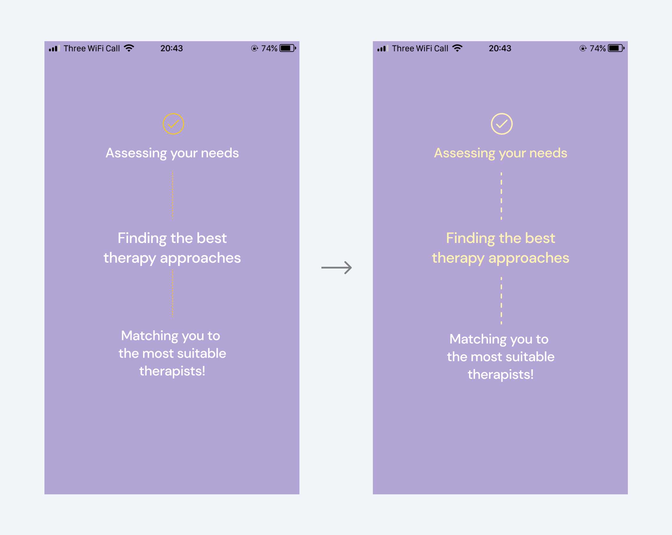
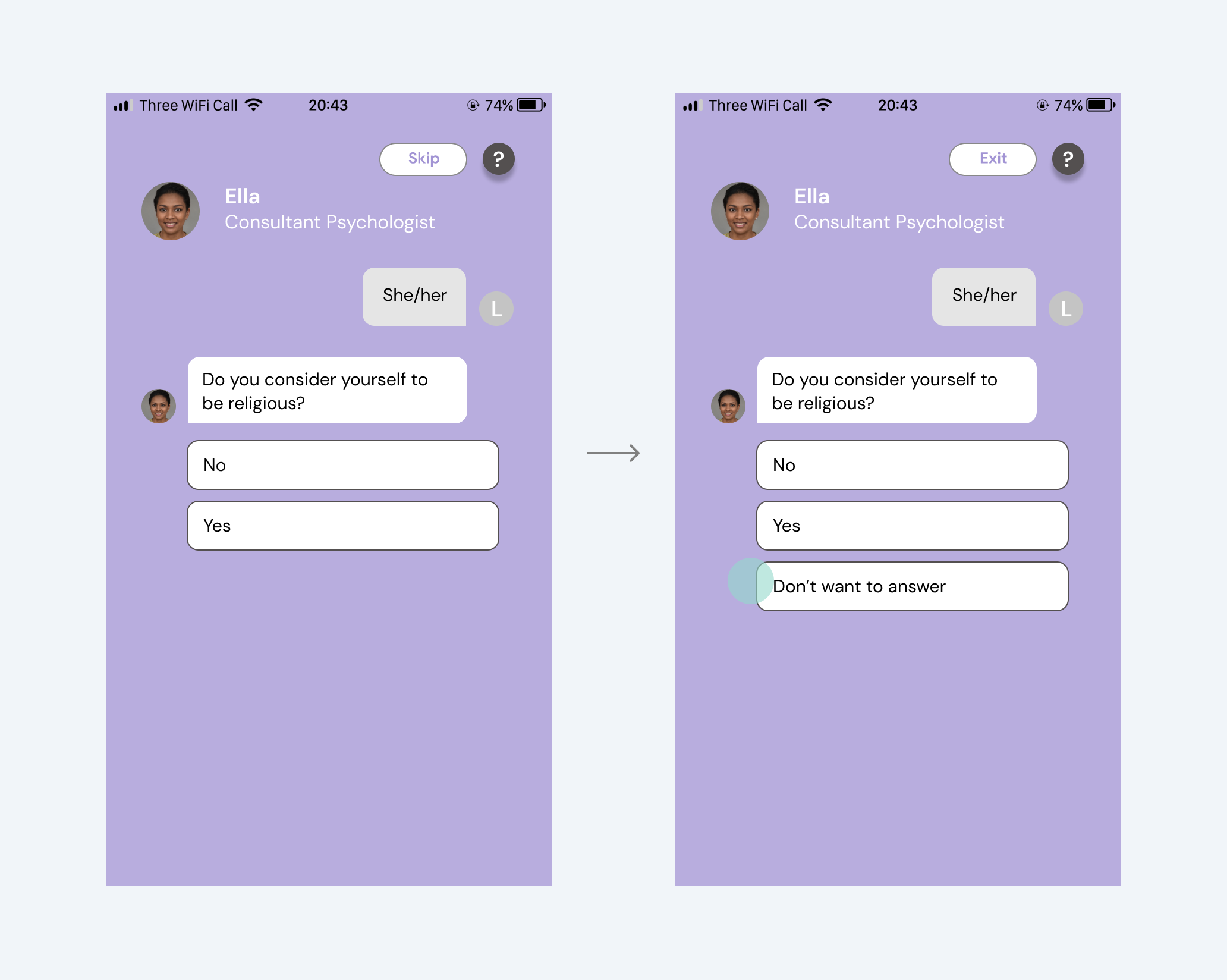
Issue 01
Users wanted to skip a specific question of the assessment.
They were stuck as they didn't want to answer specific questions but still wanted to run through the assessment. Another user misunderstood that the 'skip' button on the top means skipping a question, not an assessment.
Update
Added the 'Don't want to answer' option and renamed the 'Skip' button into 'Exit'. Providing an option to choose what to answer would give users more control for privacy.
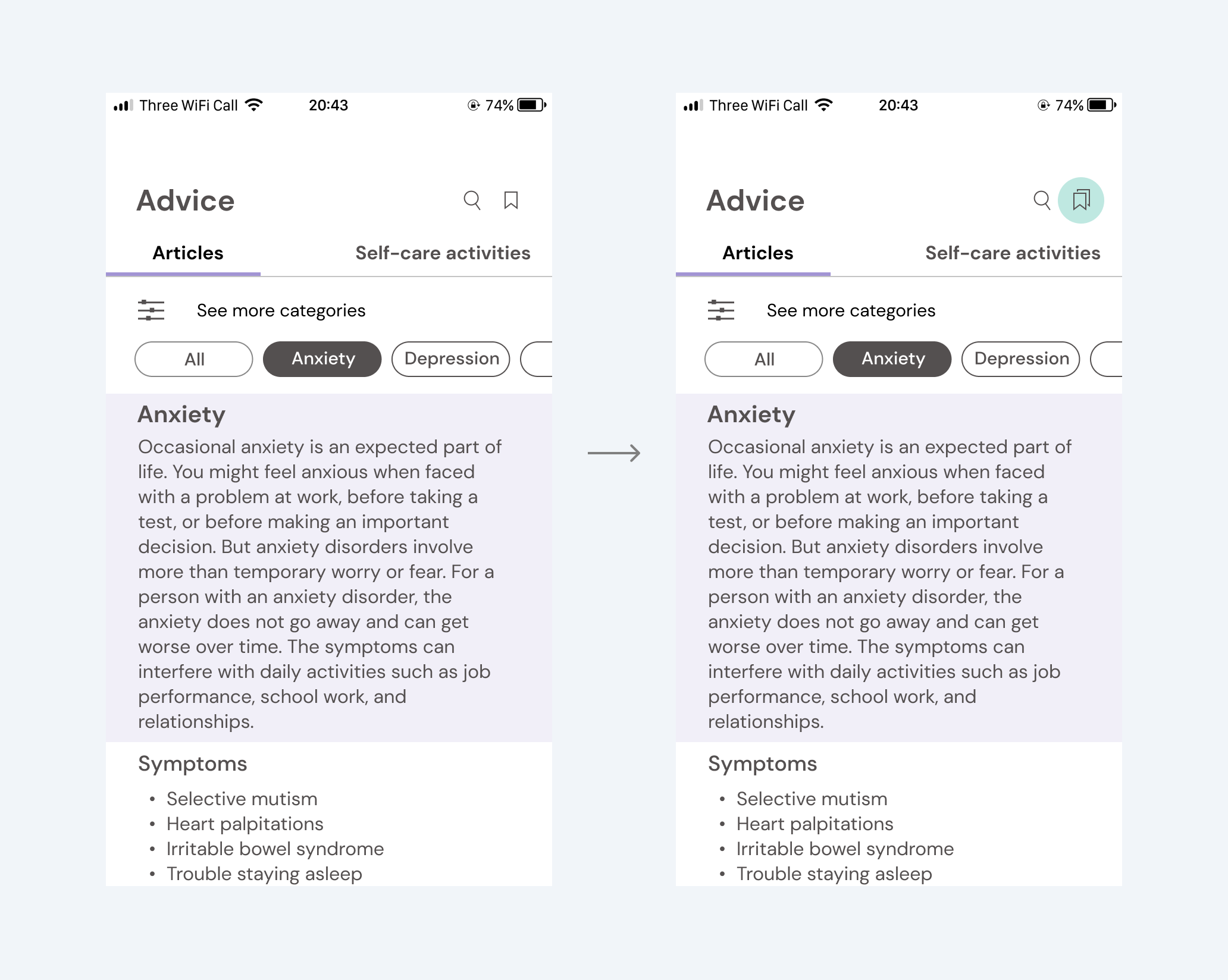
Issue 02
Two bookmark icons look the same yet function differently.
Users easily identified the bookmark icon and its use to save it for later when reading an article. But when they came back to the 'Advice' home screen, they were unsure about the same shaped icon there.
Update
Replaced the one for 'saved articles' with a stacked bookmarks icon to indicate another function.
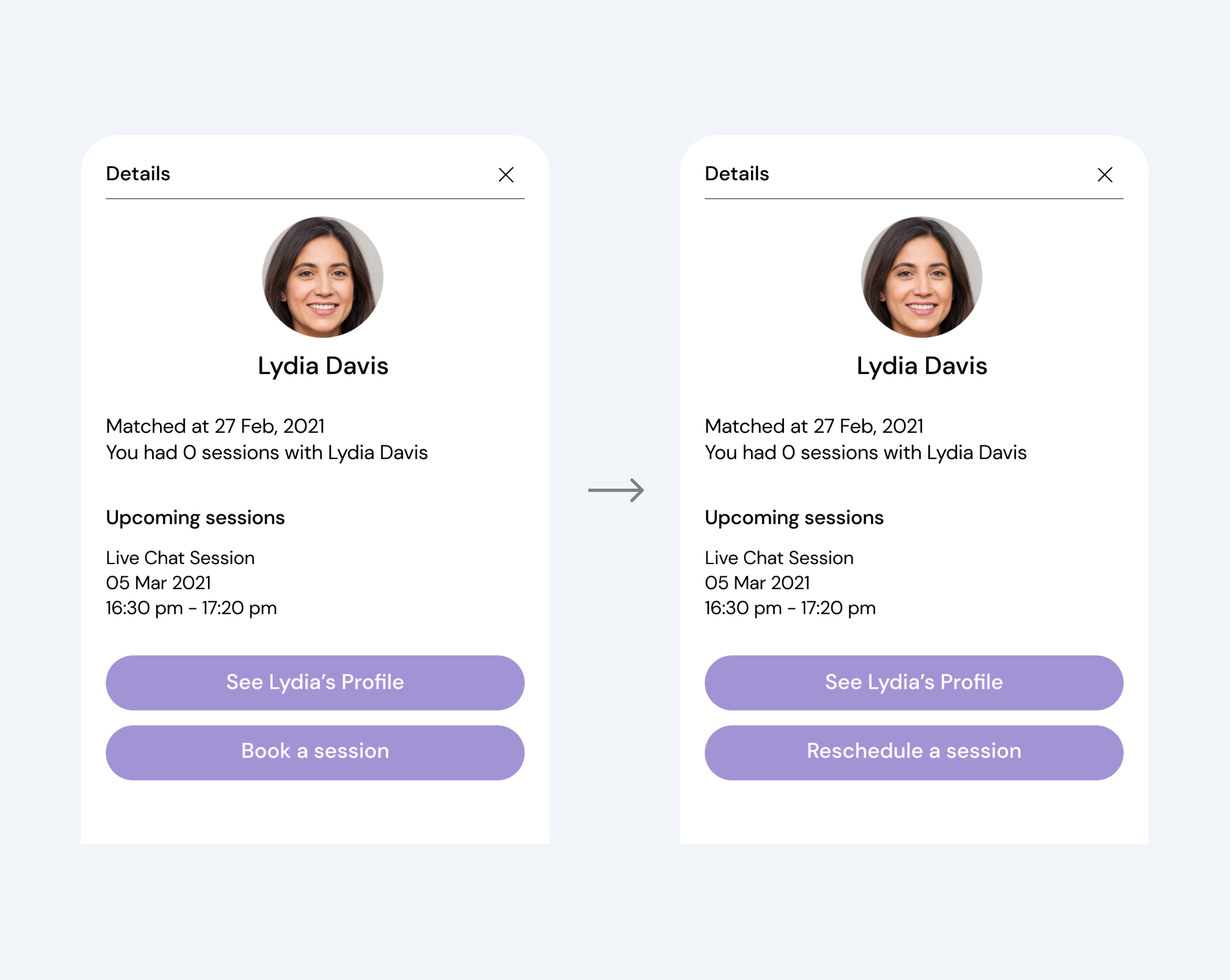
Issue 03
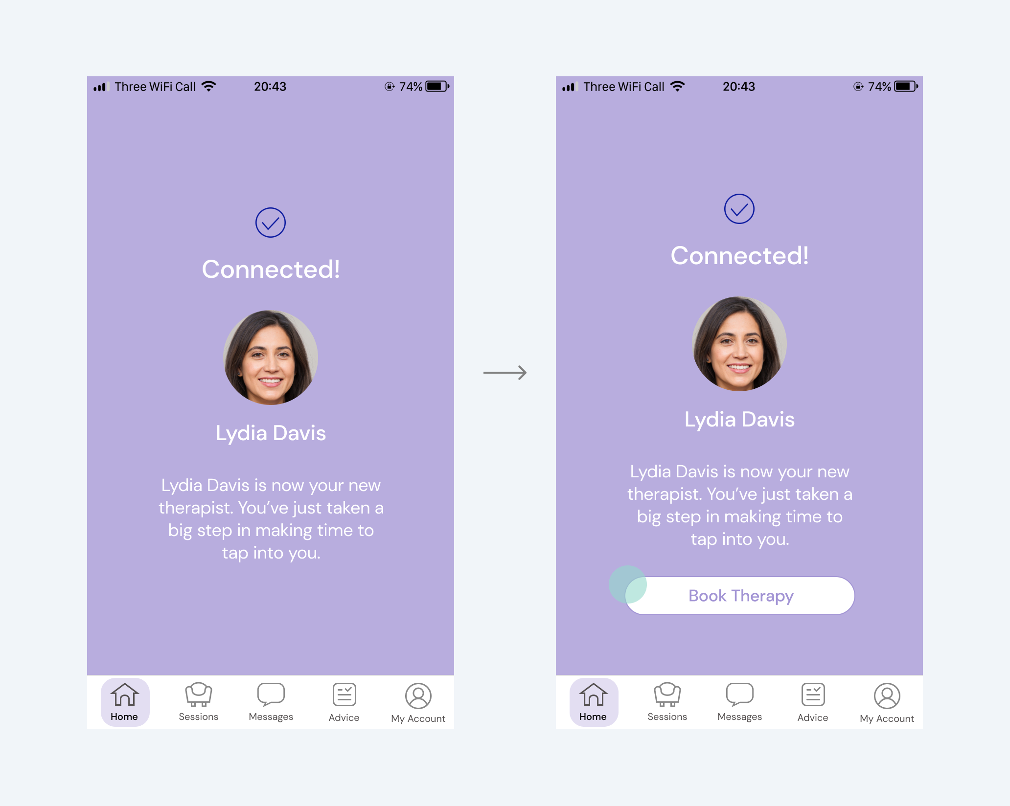
Users tried to find a 'book a session' button immediately after getting matched with a therapist.
A few were unsure where to go to book a session after matching with a therapist or wanted a shortcut to book without going through any other page.
Update
Added the 'book a session' button on a therapist match screen to serve this need. If they don't click this button, it will automatically lead users to the home screen in a few seconds, showing a modal with the therapist profile and the' book a session' button.
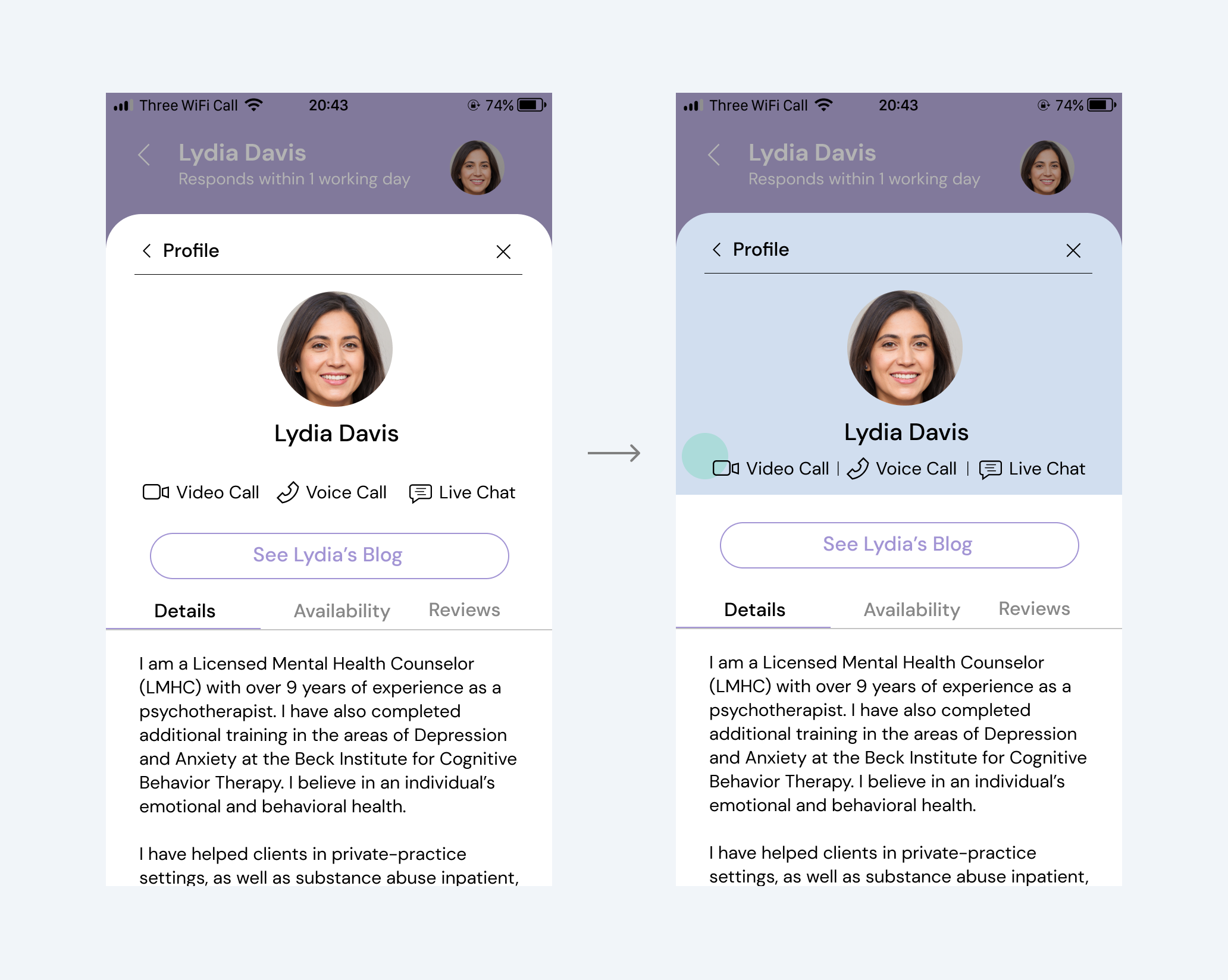
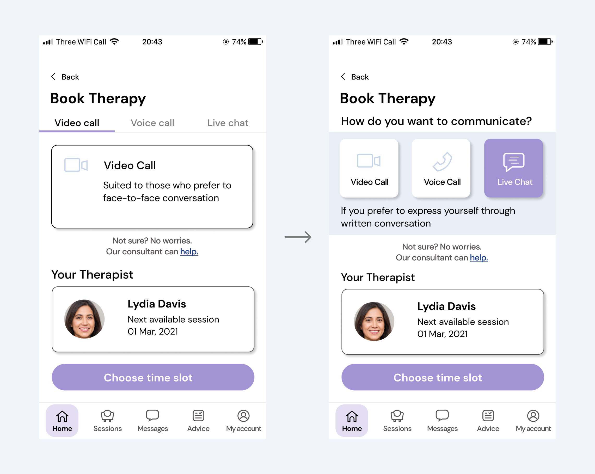
Issue 04
Users recognised communication method icons as clickable.
Therapist profile pages show three different communication methods that the therapist is available for.
Update
To make this element look clearly non-clickable, I implemented the layout using a colour block, vertical line and spacing so that it looks separated from CTA below.